Registration Completion from 10% to 80% After Flow Redesign
Reordering steps in the registration flow, showing value from the start, and building communication with users led us to a strong launch with 10,000 users gained in the first quarter.
VentraGo! is a B2C gig marketplace app where people can find short-term jobs in fields such as clothing retail, cashier assistance, assembly, promotions, warehouse work, and more.
A startup launched an early MVP, invested in marketing and acquiring its first users, but was losing up to 90% of incoming traffic during the registration process.
I joined the team as the Founding Designer, and my first task was to fix the critical product flaws left from the MVP stage.
Goals
Increase registration completion from 10% to 30–40% (at least).
Increase “first task taken within 7 days” from 8% to 20%.
Reduce support tickets about registration by 50%.
Role ↓
Lead Product Designer
Product ↓
B2C Marketplace mobile app
This is how opening the app for the first time was look like before. Dialogs on black screens are actual just a simple errors 🙈
01 Problem Statement
People were walking away before we even got to know them.
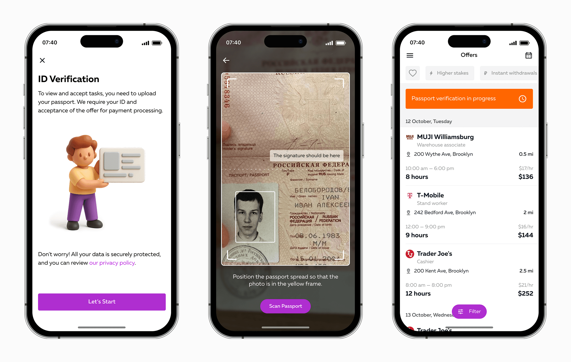
Most drop-offs happened at the ID verification step. For many, it was the first real interaction with our brand, and we were asking for sensitive documents without clearly showing why it was worth it. Some didn’t trust us yet. Others tried to scan their ID but got stuck with processing issues or error messages. A few wrote to support, confused about why we needed this at all. It was friction at the worst possible moment.
They couldn’t see the value before the ask.
New users arrived curious, but before they could explore real offers, we put a registration wall in their way. Many just wanted to see what kind of work was available before deciding if it was worth sharing personal details. By hiding the offers until after registration, we were asking them to commit before they felt ready.
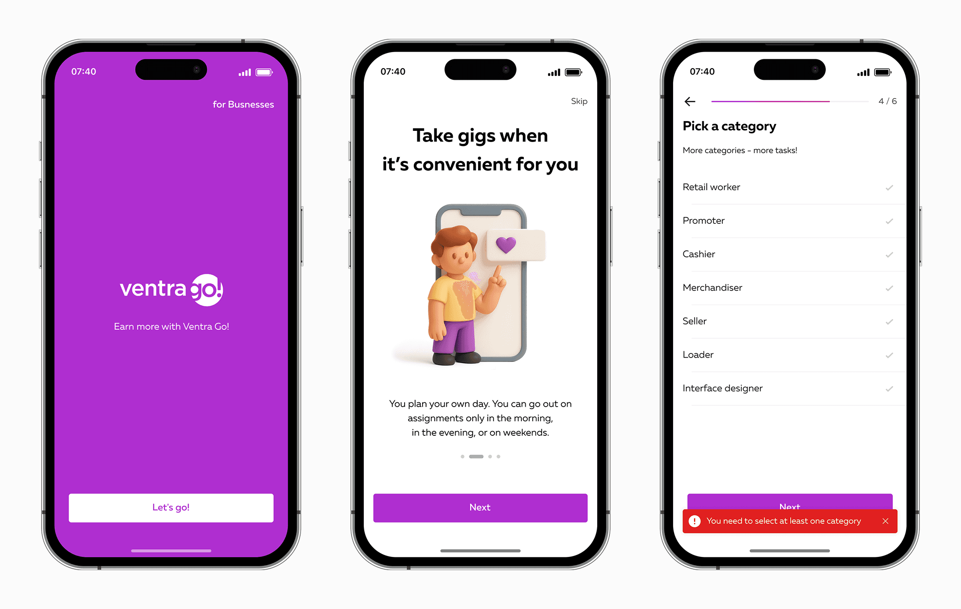
The path felt long and generic.
The screens were text-heavy, and the steps felt repetitive. Without a clear sense of progress or tailored instructions, people weren’t sure how much was left or whether they were on the right track.
02 Research & Insights
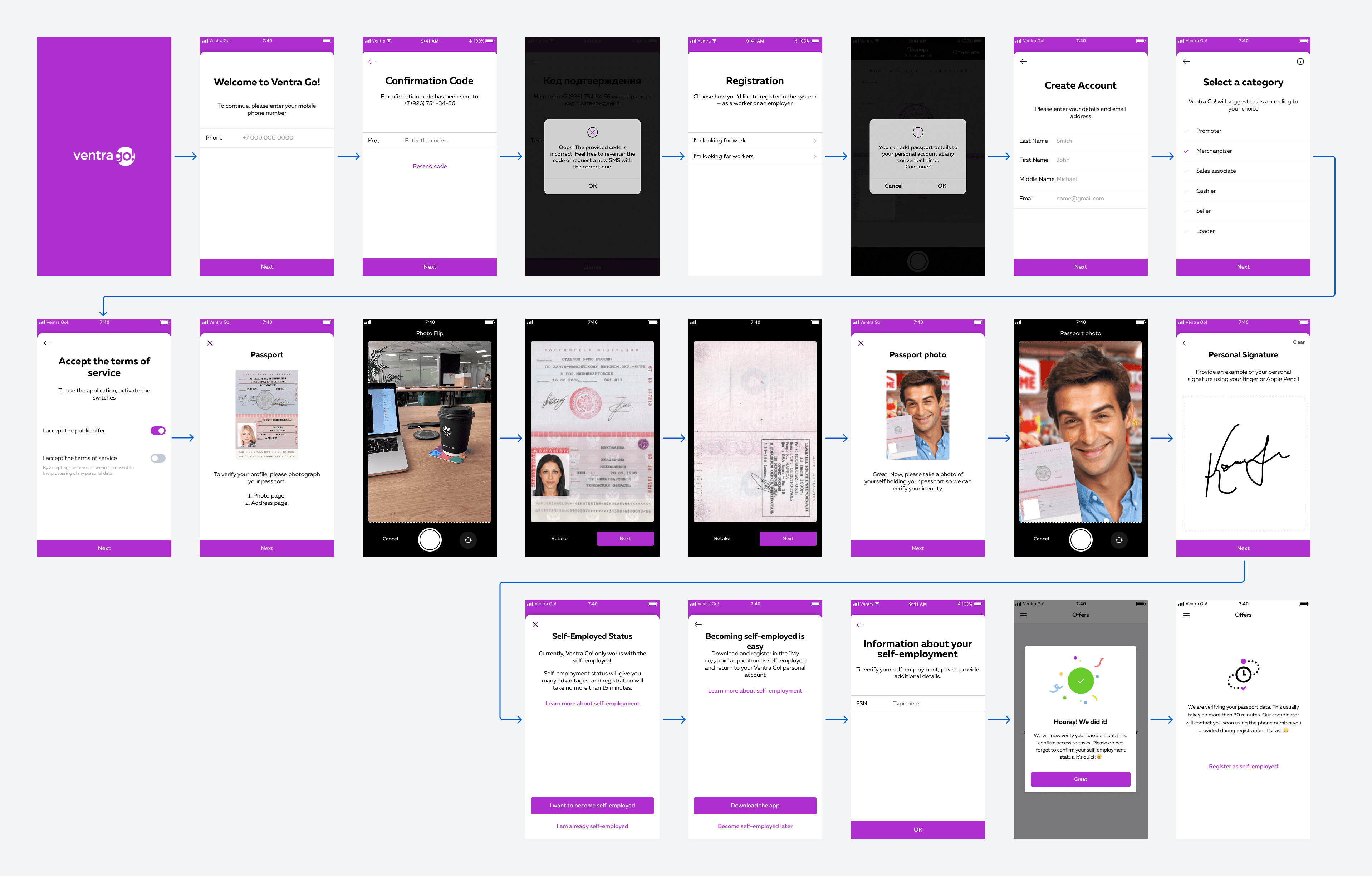
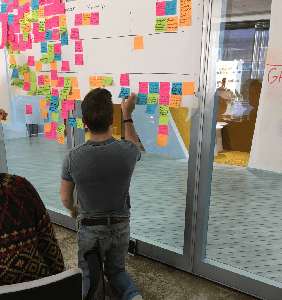
We started by breaking down the entire registration flow, screen by screen. This exposed many small but painful UX issues: extra steps that didn’t need to be there, disabled buttons with no explanation, and missing error messages in unusual scenarios.
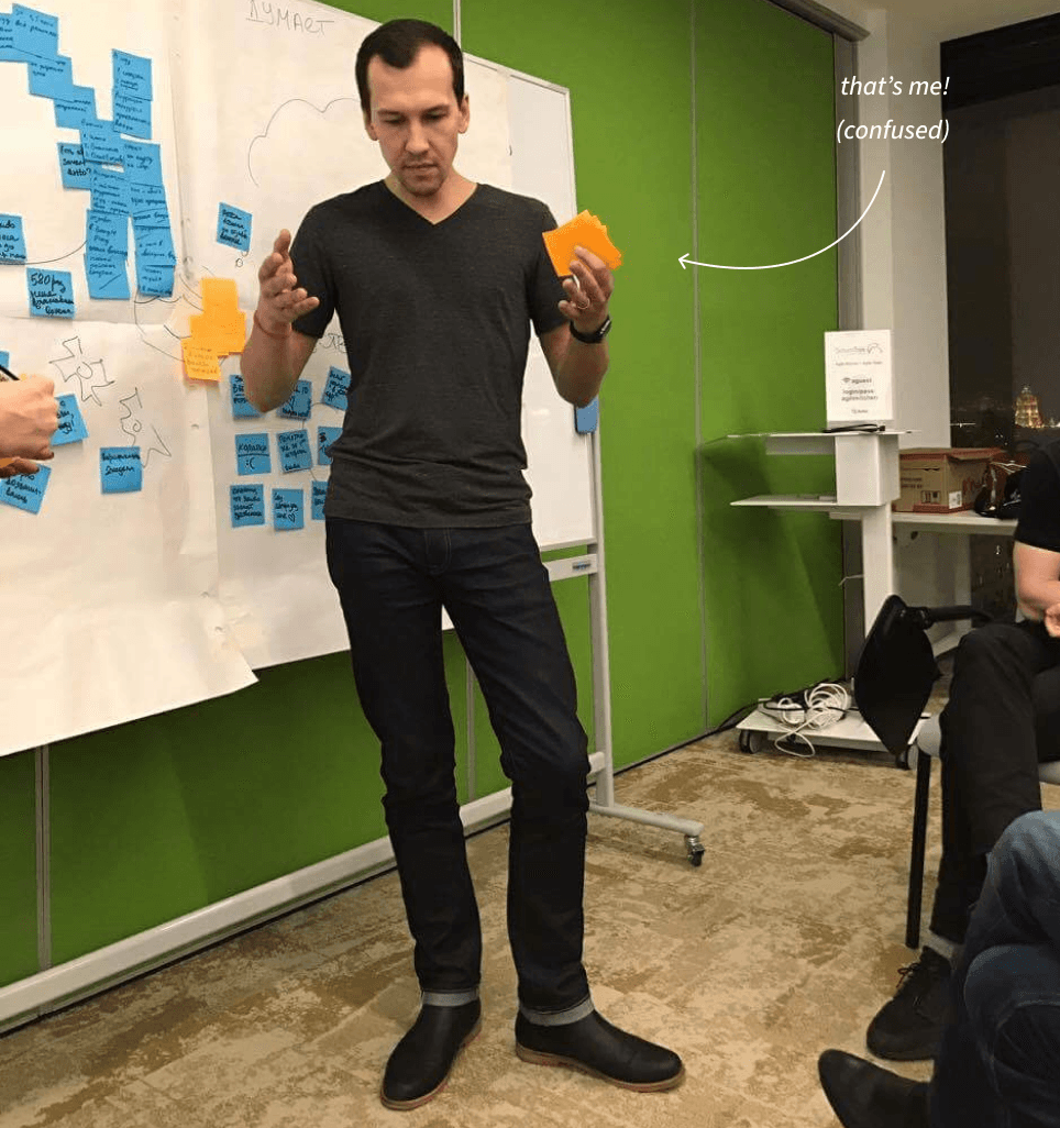
Next, we spoke directly with the people using (or trying to use) our app. We ran qualitative interviews with two main groups: younger users aged 18–25 and older users aged 45–60.
We also combed through our support tickets and pulled together app analytics and app store feedback in one place so we could see the hard numbers alongside the human stories.
Alongside the ID verification problem, we also had a lack of communication. Some screens gave no clear next step, and rare “corner cases” had no error messages, leaving users stuck without guidance.
03 solution
Early fixes and quick wins.
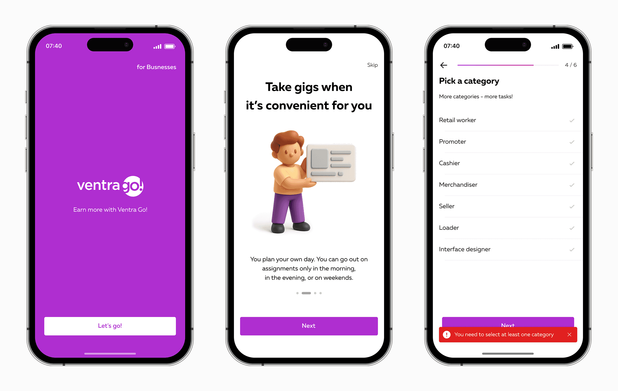
Moved category selection to the first screen, shortened the flow, removed extra steps, and added role-based onboarding. Clearer copy and progress indicators helped users understand where they were and what was next. Added clear errors, alerts, and empty states.
🚀 That reduced support tickets by 18%*
* — we separated all questions from questions about ID verification.
ID step improvements.
The first and fastest fix was to add more information about the scanning process and privacy, switch to a more reliable ID vendor, and add an overlay above the photo with tips. This reduced failed uploads and eased frustration at the most sensitive step.
The second step, in the next iteration, was moving ID verification after a user saw the main screen with all available shifts and tasks.
Building communication.
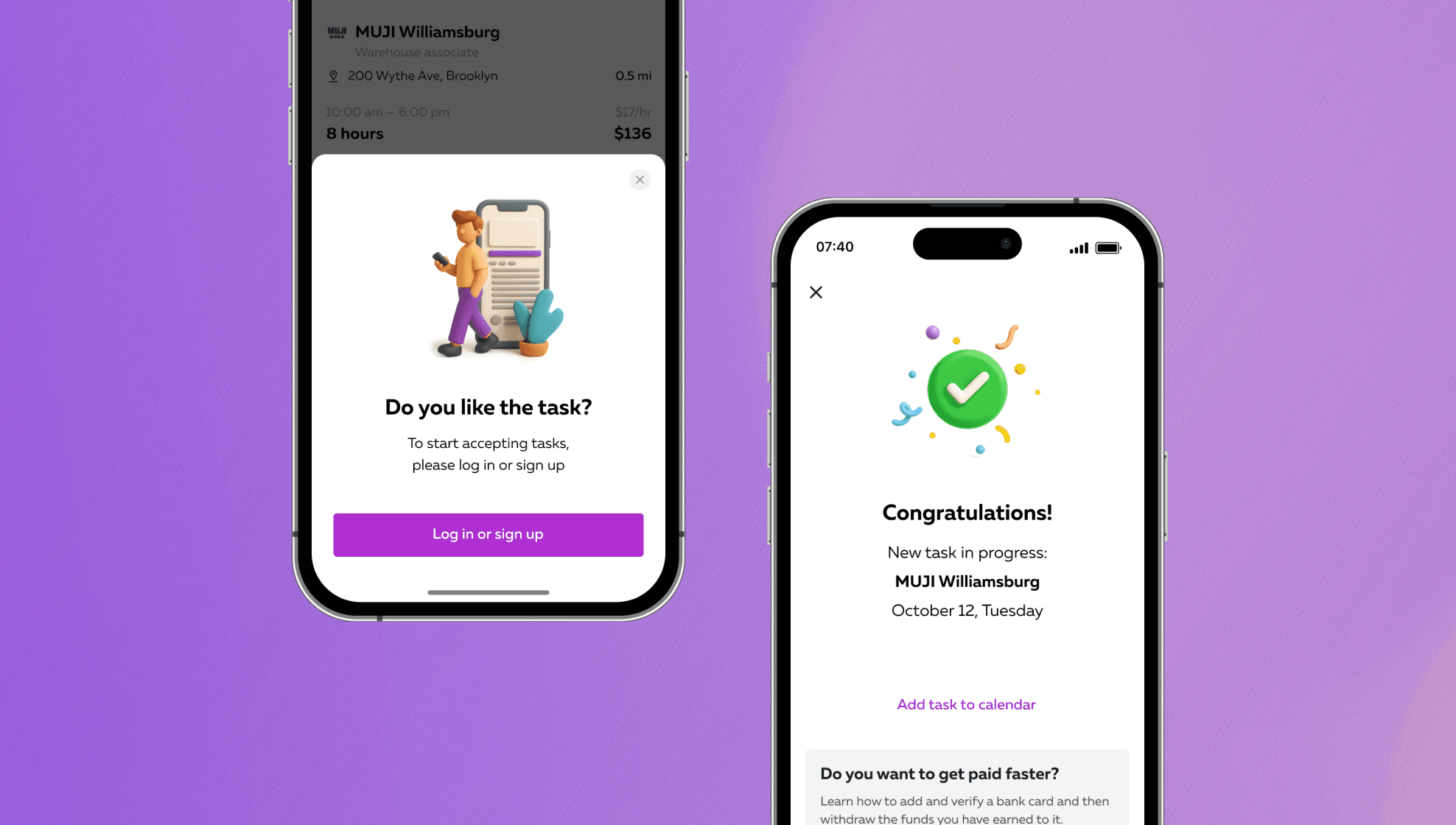
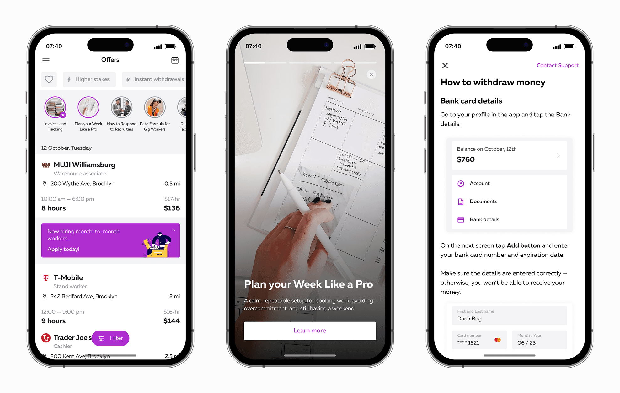
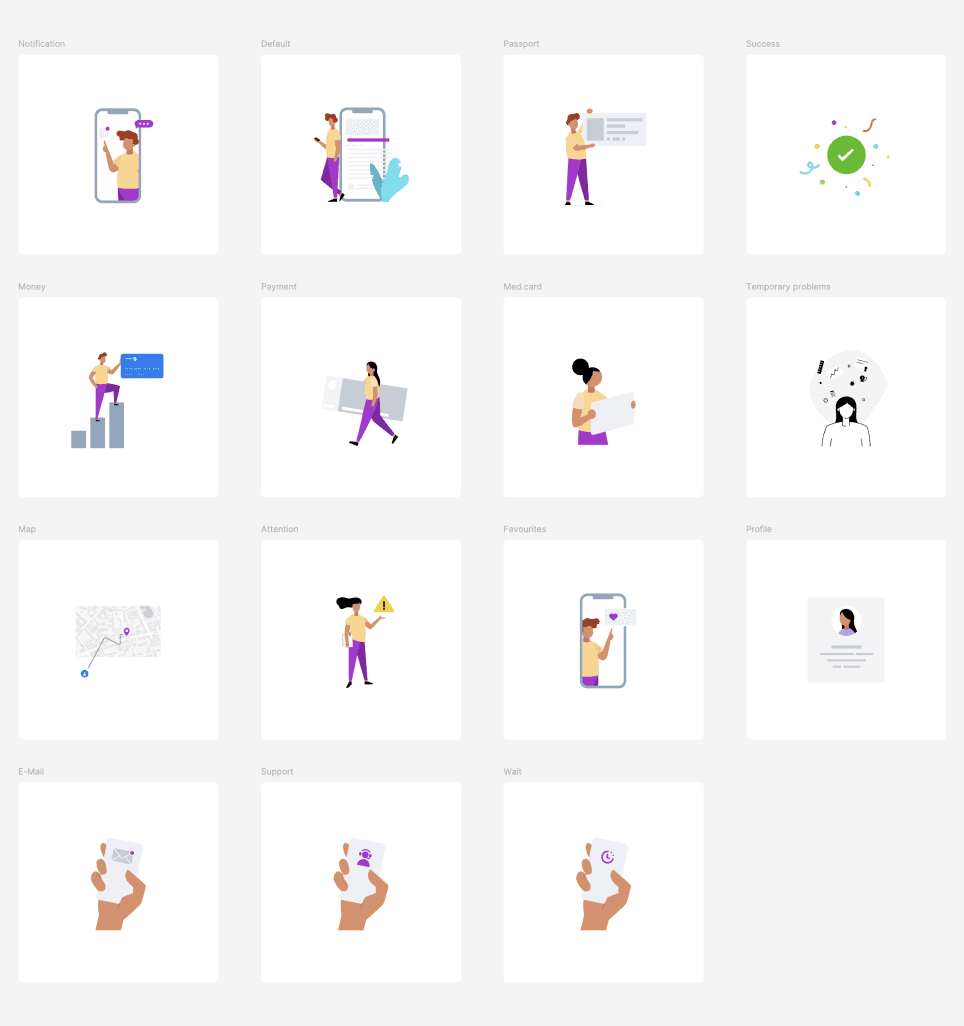
I began working on a system (long-term) to cover all possible use cases. This included onboarding screens and messages, release notes, error states, status banners, empty screen states, navigation tips, success screens, bottom sheets with tips and tricks, and a consistent illustration style.
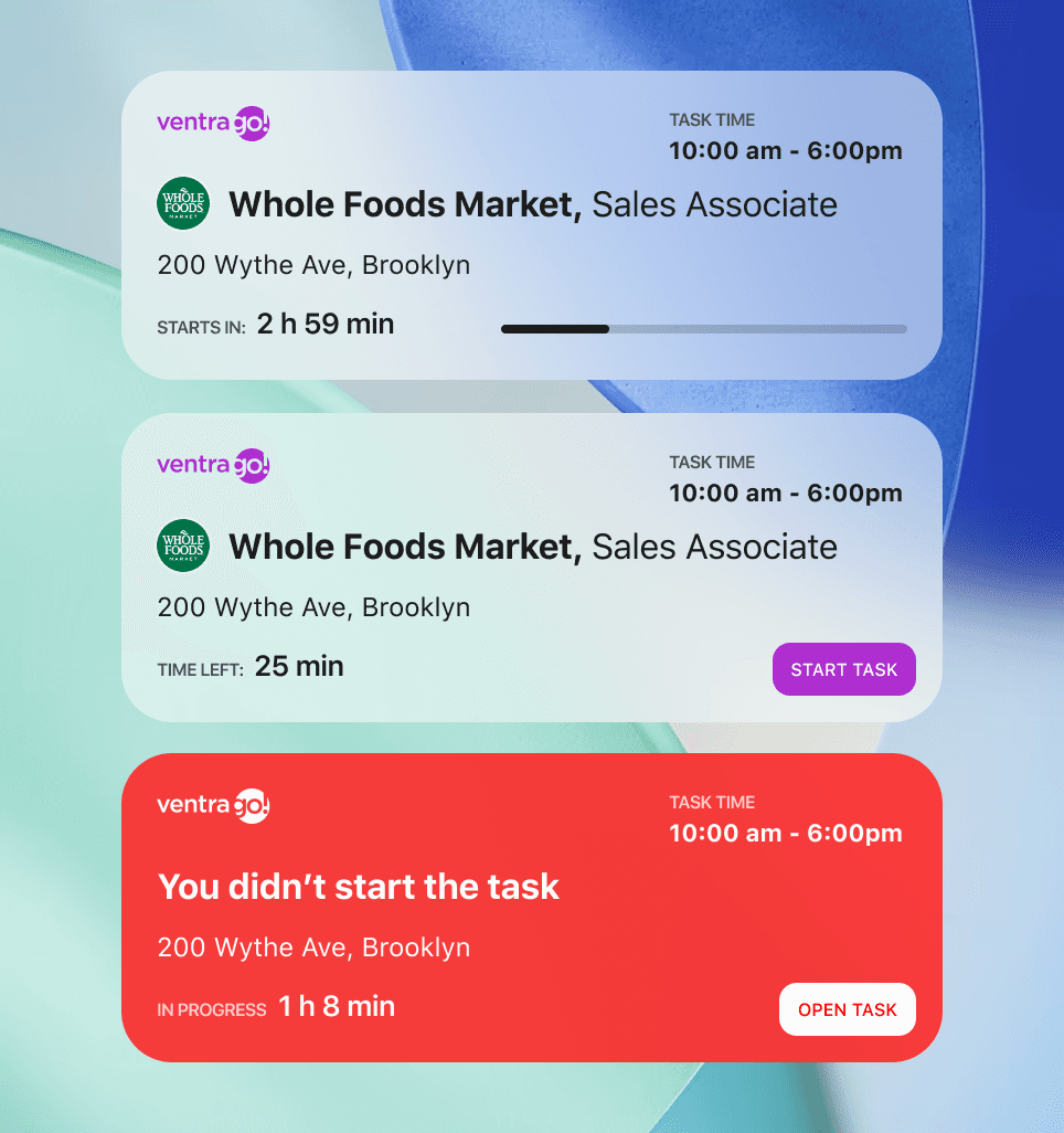
We also added Stories info banners, leaning section, Live Activities 👇
04 Takeaway
Communication is the key.
That’s become my new mantra. If we talked in person, I’d definitely tell you about it 🤘 Be gentle and friendly with users, describe everything, anticipate issues, follow feedback, and always explain your decisions.
Trust comes before commitment.
When we asked for sensitive documents too early, people hesitated. Letting them explore first gave them a reason to stay. Show value first. I knew that before, and now I understand how to achieve it.
Change works best in steps.
Quick fixes gave us early wins, and bigger changes could be tested without risking the whole funnel.
05 Impact
By the end of three iterations, the registration experience felt faster, clearer, and more human. People could see real offers before committing, upload their ID without repeated failures, and always know where they were in the process.
All of that (and, of course, a little more) led to continuous growth in our user base — reaching 800k in the next two years.
Without these changes, we wouldn’t have reached those numbers.
06 Outcome
80%
First tasks taken within 7 days increased to
24%
60%